
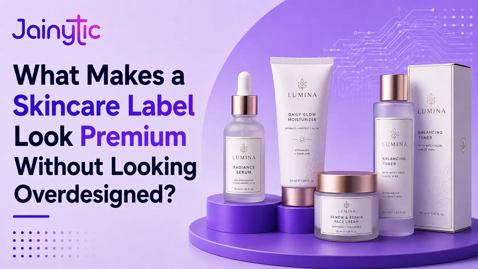
A skincare label does not need more foil, more colour, or more decoration to look premium. It needs every visible detail to feel intentional, balanced, and appropriate for the formula inside.
The Label Creates an Expectation Before the Product Is Used
A customer picks up a serum, face cream, cleanser, or sunscreen from a shelf.
Clean spacing may suggest clinical precision. Soft colour may suggest gentle care. Accurate printing and a well-fitted label may signal attention to quality.
Crowded claims, competing fonts, weak colour reproduction, or too many finishes can make an expensive formulation look less credible.
This is why brands invest in premium skincare labels. The goal is not to decorate every space. It is to communicate quality before the customer opens the container.
The Real Question Is Not How Many Premium Effects Can Be Added
Many skincare brands begin by asking whether the label should have foil, metallic ink, spot gloss, texture, lamination, or a transparent section.
That is not the right starting point.
A finish may attract attention, but it cannot rescue an unclear design. Several effects can also compete with ingredient information, usage directions, and the product name.
The better question is simple:
What should the customer understand and feel within the first few seconds?
A dermatologist-led range may need to feel precise. A botanical range may need natural simplicity. A luxury serum may need restraint. Once the intended impression is clear, the label decisions become easier.
What Are Premium Skincare Labels?
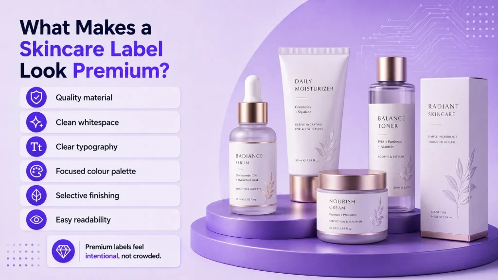
Premium skincare labels are customized labels that combine brand presentation, product information, suitable material, accurate printing, dependable adhesion, and controlled finishing.
They may carry the product name, active ingredients, benefits, quantity, directions, warnings, batch details, barcode, manufacturer information, and regulatory content.
What makes them premium is not one decorative feature. Material, typography, colour, hierarchy, finishing, and application must work as one system.
A standard label identifies a product. A premium label identifies it while helping the complete pack feel trustworthy, considered, and consistent with its market position.
1. The Material Matches the Product and Container
Material affects both appearance and performance. Paper can create a soft or crafted feel, while clear and white films can support clean graphics, moisture resistance, and durability.
The right option depends on whether the container is glass, PET, HDPE, acrylic, or another plastic. It also depends on exposure to water, oil, friction, or repeated handling.
Premium skincare labels should remain smooth, readable, and securely attached throughout use. Wrinkling, staining, or edge lifting quickly reduces the premium effect.
2. Whitespace Gives the Design Confidence
Premium design often looks calm because it does not force every claim onto the front panel.
Whitespace gives the brand name, product type, and main ingredient room to be understood. It helps customers separate primary information from supporting information.
When every corner contains icons, benefit statements, badges, patterns, and ingredients, the product can appear promotional rather than premium.
3. Typography Creates a Clear Information Hierarchy
A customer should quickly identify the brand, product name, function, and key variant.
Premium skincare labels use font size, weight, spacing, and alignment to guide the eye. They do not rely on several unrelated typefaces to create interest.
Small regulatory text must remain readable, while active ingredients and benefits should not compete with the brand identity. One or two coordinated type styles usually create a cleaner result.
4. Colour Supports the Product Position
Colour should help customers understand the brand and distinguish products without making the label feel busy.
Clinical skincare may use white, neutral, blue, or green tones. Botanical products may use earthy colours. Luxury products may rely on deep neutrals or subtle metallic details.
5. Finishes Highlight One Important Detail
Foil, spot gloss, matte lamination, textured varnish, metallic ink, and speciality films can improve the visual or tactile experience.
When the logo, border, product name, icons, and background all receive separate effects, the design loses focus. Premium skincare labels use finishing to support hierarchy, not overwhelm it.
6. The Label Fits the Container Correctly
Even excellent artwork can look weak when the label size or shape does not suit the container.
Small jars, tapered bottles, curved serum packs, tubes, and pump containers create different application challenges. Incorrect dimensions can cause lifting, bubbling, gaps, or distortion.
7. Important Information Remains Easy to Read
Skincare labels often carry more information than the front panel can comfortably hold.
Ingredients, directions, warnings, quantity, batch information, and manufacturer details are part of product trust, not visual clutter.
A premium design creates a clear front panel and organizes detailed content on the back, side, base, or a peel-and-read multilayer section when appropriate.
Reducing readability to preserve a minimal appearance is not premium. Good design balances visual restraint with practical communication.
Overdesigned Skincare Labels vs Premium Skincare Labels
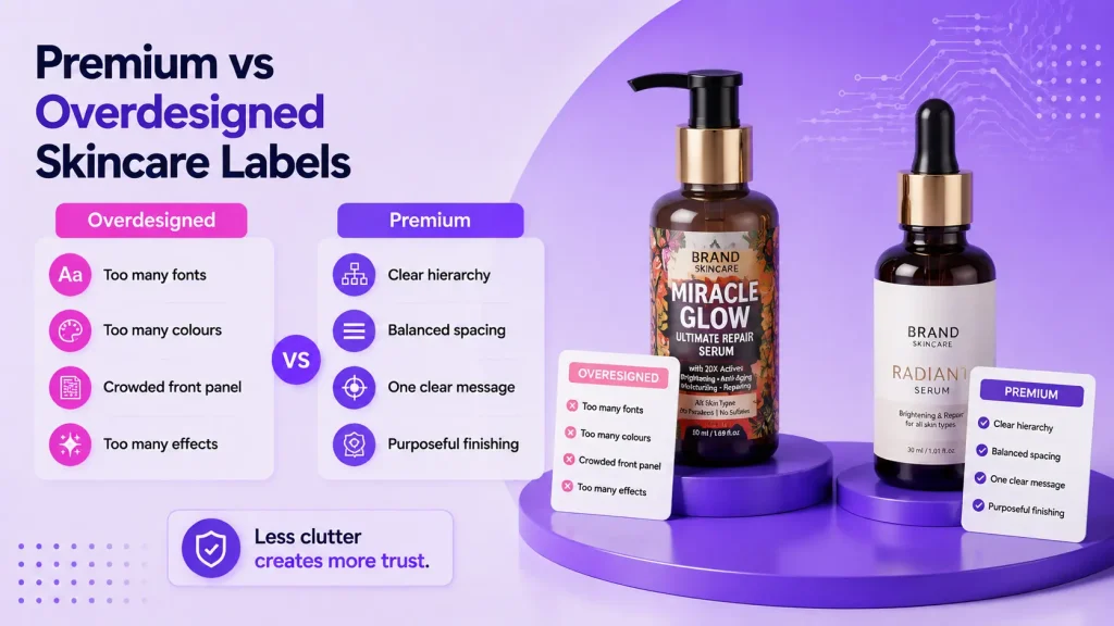
| Design Element | Overdesigned Label | Premium Skincare Label |
| Typography | Several competing fonts | Clear and consistent hierarchy |
| Colour | Too many unrelated shades | Focused brand-led palette |
| Claims | Every benefit on the front | One clear primary message |
| Finishing | Multiple effects everywhere | Selective and purposeful use |
| Spacing | Every area filled | Balanced use of whitespace |
| Product range | Each label looks unrelated | Consistent system with clear variants |
How Can a Brand Keep a Skincare Label Premium and Simple?
Start by deciding the one message the front panel must communicate. This may be the product function, active ingredient, skin concern, or formulation position.
Keep supporting claims in a secondary position. Use a limited type system and colour palette. Select a finishing effect only when it strengthens the primary message.
Test the design on the actual container. A layout that looks balanced on a large screen may feel crowded on a 30 ml serum bottle.
Review the complete range together. Premium skincare labels should create consistency across products, sizes, and variants without making every pack look identical.
Where Different Skincare Products Need Different Label Decisions
Serums often use small containers, so typography and hierarchy become critical. Face creams may provide more space but must perform around curved jars and frequent handling.
Cleansers and body care products may face water, oil, and bathroom humidity. Sunscreen labels require clear usage and warning information. Dermatologist-led products may prioritize clinical clarity, while luxury ranges may use more tactile detail.
The approach changes by category, but the principle remains the same. The label should match the formulation, container, environment, audience, and selling position.
How Jainytic Helps Brands Create Better Skincare Labels
At Jainytic, skincare labels are planned around the container, formulation, storage conditions, brand position, information requirements, and application method.
As a label manufacturer in Delhi NCR, Jainytic supports cosmetic and personal care brands with self adhesive labels, shrink sleeves, multilayer labels, security labels, and customized labeling solutions.
The process begins with practical questions. Is the container glass or plastic? Will the label face water, oil, friction, or temperature changes? Is the surface curved or tapered? Does the pack require fine regulatory text, variable data, or additional information space?
Jainytic then recommends suitable materials, adhesives, printing methods, shapes, finishes, and testing. The aim is to create premium skincare labels that look refined without compromising readability, durability, application, or production consistency.
Final Thoughts: Premium Design Knows When to Stop
A skincare label looks premium when the customer can understand it without visual effort.
The material feels appropriate. Typography is controlled. Colours support the brand. Finishing highlights rather than distracts. The label fits the container and remains readable throughout use.
Overdesign begins when every element tries to attract attention. Premium design creates hierarchy and allows one clear message to lead.
The goal is not to make the label appear expensive. The goal is to make the complete skincare product feel credible, intentional, and worth choosing before the customer experiences the formula.
Frequently Asked Questions
Suitable material, controlled typography, accurate colour, clear hierarchy, clean application, and selective finishing help a skincare label look premium.
The best material depends on the container and use conditions. Clear film, white film, coated paper, and speciality materials may be suitable depending on moisture, oil, handling, and brand requirements.
Most labels benefit from one or two coordinated type styles. The priority should be readability, hierarchy, and consistency across the product range.
No. Premium appearance can come from spacing, quality material, accurate printing, and disciplined typography. Decorative effects should be used only when they support the brand position.
Brands can use clear hierarchy, back or base labels, peel-and-read multilayer labels, or secondary packaging when appropriate. Important information should never become unreadably small.
Jainytic helps brands select materials, adhesives, printing methods, finishes, dimensions, and label constructions based on the container, use environment, information needs, and brand position.