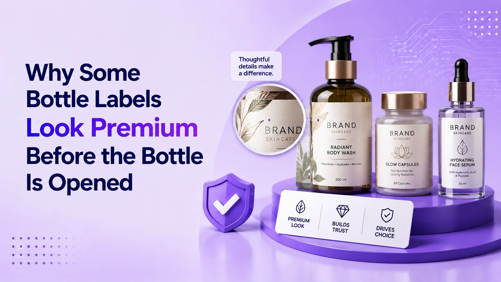
A premium label bottle is judged before the cap moves. The label is often the first detail that tells a customer whether the product feels valuable, trustworthy, and worth picking up.
The Few Seconds That Decide Shelf Appeal
A customer sees two similar bottles. One label looks sharp and balanced. The other looks thin, crowded, or misaligned.
The customer has not opened either bottle or experienced the product inside.
Still, one bottle already feels more premium.
That reaction comes from the way material, colour, printing, typography, finish, shape, and application work together.
This is why brands invest in premium bottle labels. The label must attract attention, communicate product value, and remain consistent with the bottle and the market position.
The Real Question Is Not Which Finish Looks Expensive
Many businesses begin by asking whether they should use foil, texture, lamination, embossing, or a transparent label.
That is not the best starting point.
A metallic effect may suit a luxury spirit but feel excessive on clinical skincare. A matte finish may support a natural beverage, while clear film can showcase the bottle itself.
The better question is simple:
What should the customer believe about the product before the bottle is opened?
Should it feel luxurious, scientific, natural, refreshing, powerful, traditional, or exclusive? Once that impression is clear, the material and printing choices become easier to justify.
What Are Premium Bottle Labels?
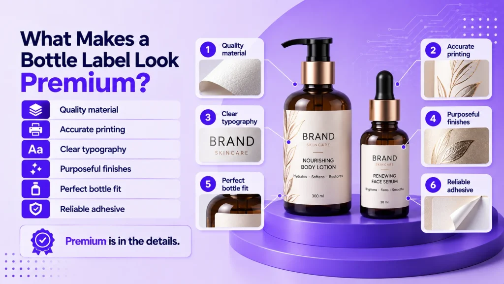
Premium bottle labels are customized labels that improve presentation while carrying brand, product, quantity, ingredient, instruction, batch, barcode, and regulatory information.
What makes them premium is not simply a higher price or a special finish.
Material, printing, colour, hierarchy, finishing, adhesive, and application must support one consistent result.
A standard label identifies the bottle. A premium label identifies it while helping the complete product feel more considered.
1. The Material Matches the Product Position
Material creates an immediate visual and tactile signal. Coated paper offers colour richness, textured paper suggests craftsmanship, clear film creates a clean appearance, and white film supports durability and strong colour.
The right material depends on the product, bottle surface, storage conditions, and brand character.
Premium bottle labels should feel connected to the container. Glass, plastic, and chilled beverage bottles can require different constructions.
Material must perform through moisture, refrigeration, oil, handling, and friction. Wrinkling, tearing, transparency, or edge lifting quickly reduces the premium effect.
2. Colour and Printing Look Controlled
Premium packaging rarely depends on the number of colours used. It depends on how accurately and consistently those colours appear.
Blacks should look clean, fine text readable, gradients smooth, and brand colours consistent across batches and sizes.
Poor registration, banding, weak ink coverage, or unclear text can reduce the value perceived in the entire bottle.
Good premium bottle labels use printing and artwork settings suited to the material, quantity, detail, and finish.
3. Typography Creates a Clear Hierarchy
Customers should quickly understand the brand, product type, variant, and main benefit without searching through competing text.
Premium label design uses spacing, font size, weight, and placement to guide attention.
Skincare may prioritize an active ingredient, beverages may emphasize flavour, and liquor may highlight age, origin, or edition.
The back label can carry details, but it should remain organized and readable. Premium means presenting useful information with control.
4. Finishes Are Used With a Purpose
Foiling, spot coating, lamination, textured varnish, metallic ink, and special films can add visual interest.
However, finishes work best when they emphasize a meaningful part of the design.
Foil can highlight the brand name, selective gloss an illustration, and texture a handcrafted position.
When every element shines, the design loses focus. Effective premium bottle labels often use one or two controlled effects.
5. The Label Fits the Bottle Correctly
Even excellent artwork can look weak when the label size or shape does not suit the bottle.
Curves, tapers, panels, seams, and texture affect how a label sits. The wrong shape can cause lifting, bubbling, or distortion.
Dimensions should account for printable area, application direction, overlap, gap, and shelf orientation.
Accurate cutting and application keep the label consistent from bottle to bottle. Premium appearance depends on repeatability.
6. Adhesive Performance Protects the Appearance
Adhesive is rarely visible, but it strongly affects how the label looks over time.
The wrong adhesive can cause lifting, sliding, bubbling, or failure. Performance changes with bottle material, moisture, cold storage, filling temperature, and chemical exposure.
Glass, PET, HDPE, and coated containers do not always require the same adhesive approach.
Premium bottle labels should be tested on the actual bottle through realistic filling, transport, storage, and use. Appearance has little value if adhesion fails.
7. Small Details Make the Design Feel Finished
Premium presentation often comes from details customers do not consciously identify.
Clean corners, even margins, sharp cutting, accurate barcodes, consistent placement, and balanced spacing shape the final impression.
Front and back labels should feel connected. Regulatory content and variant colours should remain part of one recognizable system.
These small decisions make the bottle appear professionally planned before the product is experienced.
Basic Bottle Labels vs Premium Bottle Labels
| Feature | Basic Bottle Labels | Premium Bottle Labels |
| Material | Standard stock | Selected for appearance and performance |
| Printing | Functional reproduction | Controlled colour and fine detail |
| Design | Information focused | Clear hierarchy and brand consistency |
| Finishing | Limited or generic | Selective and purpose driven |
| Application | Basic placement | Accurate fit and repeatable alignment |
| Performance | General use | Tested for bottle and environment |
Which Premium Bottle Label Should You Use?
Here is the simplest way to decide.
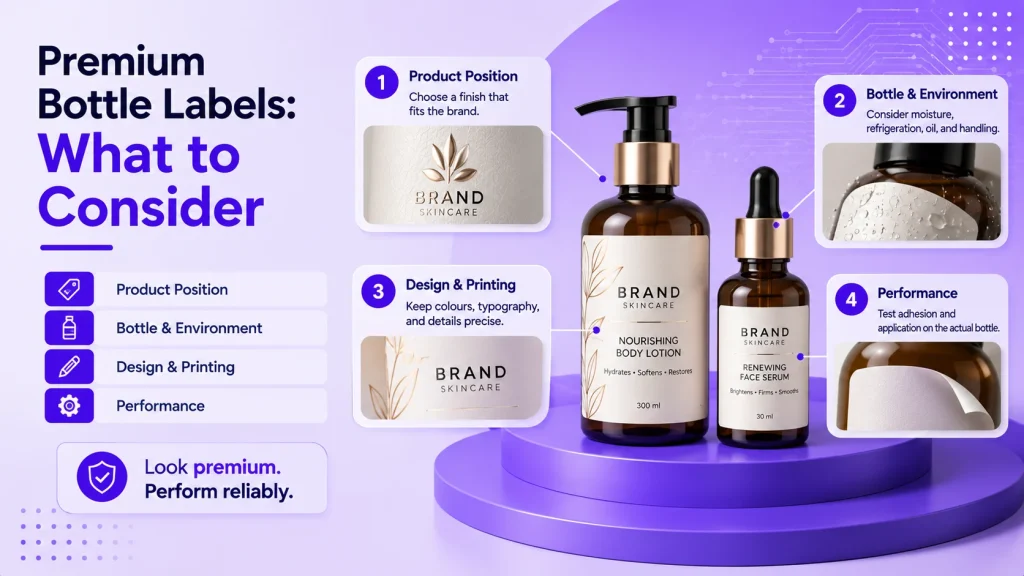
For a clean modern appearance, consider clear or white film with restrained typography. Crafted products may suit textured paper, while luxury ranges can use selective foil or tactile finishes. For water, oil, refrigeration, or frequent handling, prioritize durable material, protected printing, and tested adhesive.
The strongest solution is the one that supports the product position and survives the complete product journey.
Premium bottle labels should not be selected from a finish catalogue alone. They should be developed around the bottle, environment, information, production method, and customer expectation.
Where Different Industries Use Premium Bottle Labels
Cosmetic and skincare brands use premium skincare labels to communicate formulation and refinement. Beverage brands create flavour and shelf distinction, while liquor brands support heritage, exclusivity, and gifting.
Pharma and wellness brands require clarity and trust. Automotive, chemical, and lubricant products need durability. Food and FMCG brands use labels to distinguish variants and benefits quickly.
The visual language changes by industry, but the objective remains similar: make the bottle feel credible and appropriately positioned before it is opened.
How Jainytic Helps Brands Create Better Bottle Labels
At Jainytic, bottle labels are planned around the container, product category, brand position, filling process, storage, information, and application method.
As a label manufacturer in Delhi NCR, Jainytic supports brands with self adhesive labels, wet glue labels, shrink sleeves, security labels, multilayer labels, and customized bottle labeling solutions.
The process begins with practical questions. Is the bottle glass, PET, or HDPE? Will it face moisture, refrigeration, oil, heat, or chemicals? Is the surface straight, tapered, or textured? Does the artwork need fine text, variable information, or special finishes?
Jainytic then recommends suitable materials, adhesives, printing, shapes, finishes, and testing. The aim is to improve presentation without compromising readability, durability, application, or production efficiency.
Final Thoughts: Premium Is Seen Before It Is Experienced
Customers cannot judge the complete product while it is still sealed. They rely on visible signals.
Bottle shape, colour, closure, and label create expectations. When coordinated, the product appears more trustworthy and valuable.
Choosing premium bottle labels is not about the most expensive material or brightest finish. Every decision must be appropriate.
Material should match the product. Printing should be precise, typography clear, finishes purposeful, adhesive dependable, and application consistent.
A customer may open the bottle later, but the label has already helped decide whether they will pick it up.
Frequently Asked Questions
Premium bottle labels combine suitable materials, accurate printing, controlled design, dependable adhesive, and purposeful finishes to improve presentation and communicate value.
The right material depends on the bottle, product, storage, and brand identity. Options include coated paper, textured paper, clear film, white film, and speciality materials.
Balanced typography, accurate colour, quality material, clean cutting, consistent application, and selective finishing create a stronger effect than excessive decoration.
Yes, when the face material, printing protection, and adhesive are selected and tested for moisture, condensation, cold storage, and handling conditions.
Peeling or bubbling can result from unsuitable adhesive, contamination, moisture, bottle curvature, surface texture, poor application pressure, temperature changes, or incorrect label dimensions.
Jainytic helps brands select materials, adhesives, printing, finishes, sizes, shapes, and application requirements according to the bottle, product environment, and market position.